Case study · Brand + Website · 2024
MOD Company.
A custom-organized home brand needed a small, deliberate identity and a site the owner could run without phoning the designer.
The problem
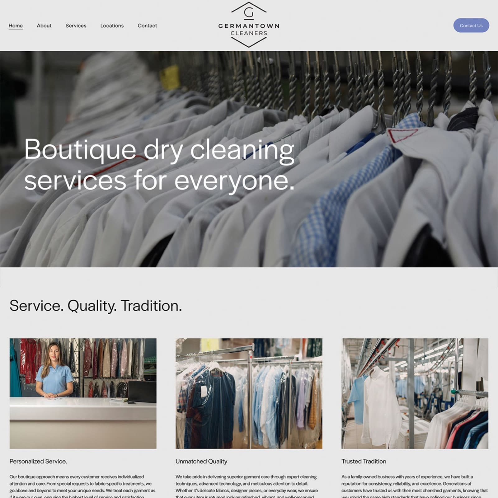
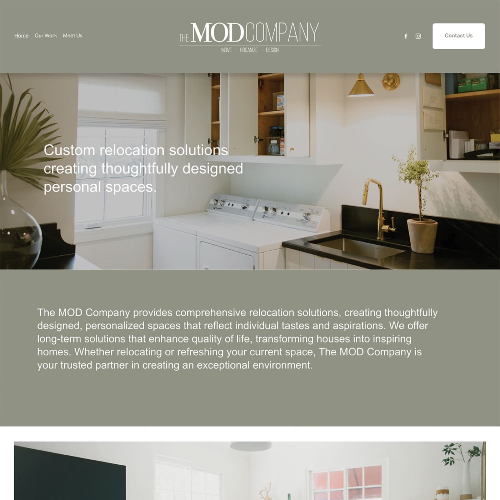
The MOD Company is a custom home-organization service — a real person, in your house, redesigning your closets and laundry rooms with you. It's the opposite of the off-the-shelf bin-and-label industry that dominates the category.
The brand needed to read that way at first glance. Considered. Hand-touched. Quietly premium. Not corporate, not franchise, not the same blue-and-white "organizers in matching polos" look that every local competitor leans on.
And the owner needed to run it. Whatever we shipped had to be editable by her, post-launch, without billing hours every time the about page needed a tweak.
The approach
We started with the wordmark — a custom-spaced THE MOD COMPANY treatment with the line "MOVE · ORGANIZE · DESIGN" sitting under it as a permanent service summary. The tagline never has to be remembered or reintroduced; it lives in the mark.
Sage-green and warm-cream palette borrowed from interiors photography. Photography direction that prefers a real kitchen mid-organization over the impossibly tidy stock shots the category overuses. Real homes, mid-transformation, with a person in the frame.
Squarespace as the build platform — not because it's where we'd go for a marketing-heavy site, but because the owner needs to own and update it without us. That's the entire point.
The mark IS the name. "MOVE · ORGANIZE · DESIGN" anchors the three services so the homepage never has to over-explain. Works at favicon size, business-card size, and 6-foot vinyl banner size.
The category default is sterile clinical white. The MOD palette splits the difference between residential warmth and professional credibility — sage #8E9E7B for primary, cream #F4ECDC for surface, charcoal #1F1A14 for typography.
A small service business doesn't need Next.js. It needs a site the owner can update on a Sunday morning between client calls. Squarespace was a deliberate choice, not a fallback.
Six Instagram tile templates in both olive-backdrop and white-backdrop variants — so the social grid stays on-brand without anyone designing on Canva at 11pm.
The outcome
The MOD Company shipped with a full identity, a live site, business cards, and an Instagram template kit — everything needed to present consistently across surfaces from day one.
Two years on, the brand still holds. The owner edits the site herself. The Instagram grid stays cohesive without redesigner intervention. The mark reads as confidently at a real-estate referral lunch as it does on a 30-yard utility van decal.
The brand-forge cliché is that you can tell a good identity by how rarely the client asks for new variations. MOD doesn't ask. That's the win.
What we shipped
Related work
Talk to us
Tell me what's on your bench — brand, site, app, design work, printing, migration off something painful. We'll figure out together whether Brand Forge is the right shop.