Case study · Brand refresh + Website · 2024
Germantown Cleaners.
An eighty-year-old Memphis dry cleaner gets a name that fits its zip code and an identity that earns its 'boutique' label.
The problem
Bensingers had been cleaning Memphis-area clothes for decades. Multi-generational family business, real trust, real loyalty within a recognizable customer radius. Inside the radius, the brand was beloved. Outside of it, the name didn't translate.
And the visual identity had aged into a place where the quality of the service no longer matched how the brand presented itself. A boutique-dry-cleaner positioning was being earned every day at the counter — but a stranger driving past the storefront wouldn't have guessed.
We had to do two things at once: honor the decades of equity inside the radius and create a brand that read as premium to anyone seeing it for the first time.
The approach
The strategic move was the rename. Bensingers → Germantown Cleaners. The new name anchors to the affluent Memphis suburb the business already serves — a customer typing "dry cleaner germantown" now finds it instantly, and a new arrival who's never heard of Bensingers immediately understands what the brand is and where it lives.
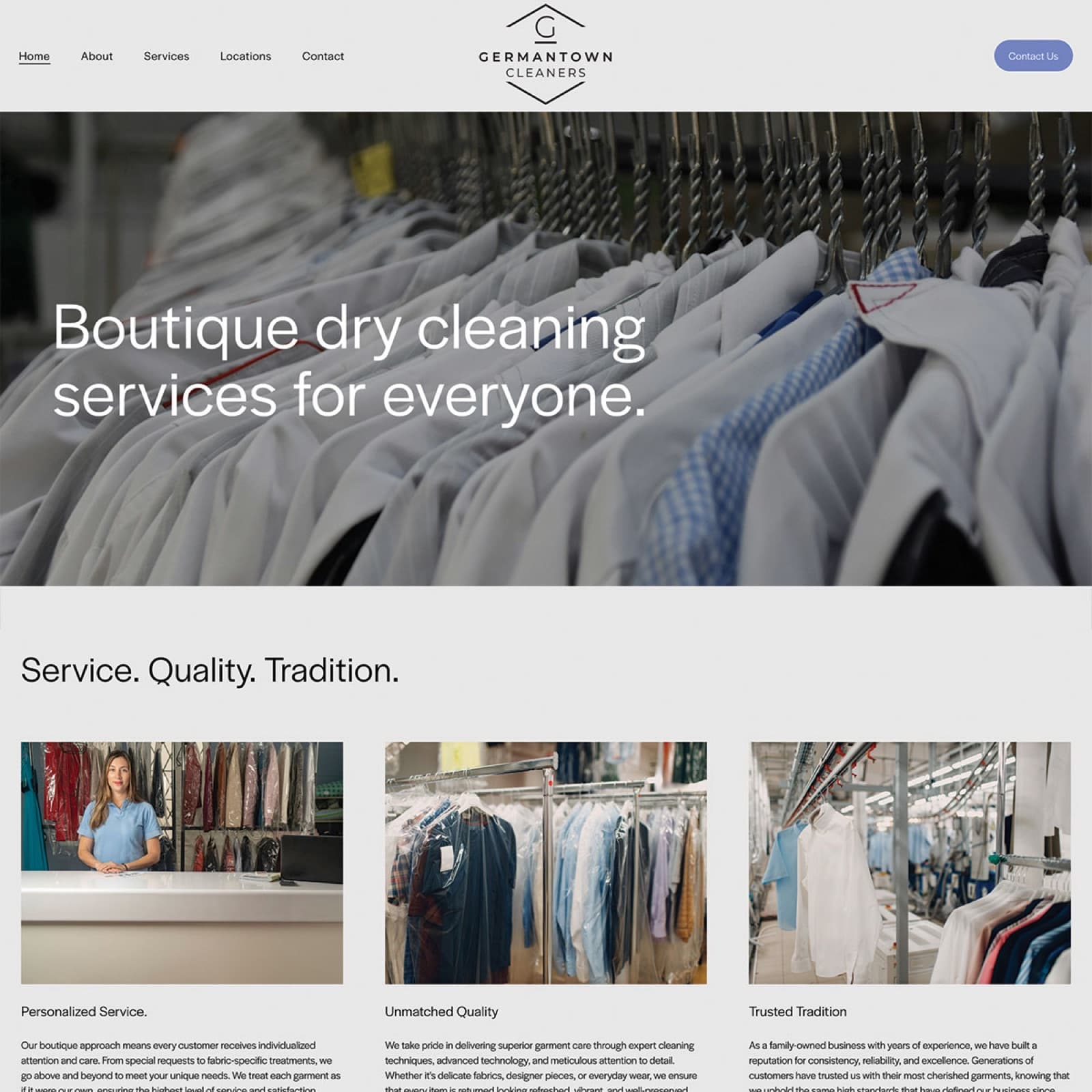
The hexagonal G monogram does double duty: it's a literal G, but the hex shape reads as a kind of crest — formal without being stuffy. Paired with a clean serif wordmark, the mark earns the "boutique" positioning without ever needing to say the word "boutique."
Cream, charcoal, and a quiet gold accent. The kind of palette you'd see in a private-label menswear shop, applied to a service category where almost nobody works this hard on visual identity. That's the wedge.
Bensingers' equity was real, but the name was working against the business outside its existing customer radius. "Germantown Cleaners" is the SEO win, the new-customer-comprehension win, and the storefront-signage win in one decision.
A formal-shape monogram lets the brand show up on hangers, garment bags, and door decals at small sizes — sizes where a wordmark would just be a blur.
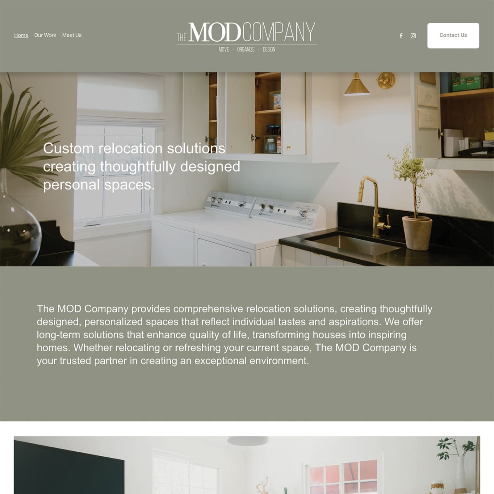
Cream-and-charcoal palette, refined serif wordmark, generous spacing, restrained imagery. The brand looks boutique. The site never has to claim it.
Services menu, locations, contact, FAQ — all editable by the owners on a Sunday afternoon. Same logic as MOD: a service business doesn't need a CMS the size of a bank.
The outcome
Existing customers kept coming in — the rename was communicated cleanly enough that the disruption was minimal. New customers who'd never heard of Bensingers started finding the business through search and through recognizing the new signage.
The boutique positioning earned the price point. The visual identity stopped fighting against what was happening behind the counter and started reinforcing it. A multi-generation family business now reads on first impression the way it always did on tenth.
What we shipped
Related work
Talk to us
Tell me what's on your bench — brand, site, app, design work, printing, migration off something painful. We'll figure out together whether Brand Forge is the right shop.